You have exactly 0.05 seconds. That is the blink-of-an-eye window in which a visitor forms an opinion about your website and decides whether to stay or bounce. In today’s high-speed digital economy, your greatest competitor isn’t another brand, it is the back button.
Struggling to stand out in a crowded market often comes down to a single invisible metric: cognitive load. When a user lands on your page and has to “think” too hard about where to click, what you do, or how much it costs, you’ve already lost. At Trust Media, we view web design not as an aesthetic exercise, but as the engineering of clarity. We believe that every pixel should serve a purpose: reducing the friction between a user’s problem and your solution.
UX is Human Behavior, Not Just Pixels
Modern User Experience (UX) is often misunderstood as simply “making things look pretty.” In practice, high-performance UX is the study of human behavior and decision-making. It is the art of building confidence through consistency. When your website feels intuitive, it signals to the user that your business is organized, reliable, and professional.
Conversely, a confusing website creates a “trust deficit.” If you cannot guide a visitor through a simple menu, why should they trust you to handle their home remodeling project or their sensitive medical records? Clarity is the baseline of credibility.
“Design inconsistencies reduce trust, increase friction, and hurt conversion rates. Returning customers convert at 2–3x the rate of first-time visitors primarily because clarity and trust have already been established.” , 2026 CRO Benchmark Analysis
By focusing on behavior over decoration, you can transform your site from a static brochure into a high-velocity conversion engine. This shift in perspective is what separates a local business that merely exists online from one that dominates its local market.
The High Cost of Friction
Friction is anything that prevents a user from accomplishing their goal. It can be a technical issue, like a slow-loading page, or a psychological one, like a vague “Get Started” button that doesn’t explain what happens next. In 2026, the data shows that the cost of this friction is higher than ever.
| Friction Point | Impact on Performance |
|---|---|
| Page Speed | A shift from 2.4s to 5.7s load time can result in a 3x drop in conversions. |
| Mobile Forms | Complex forms with 4+ fields are responsible for 62% of mobile drop-offs. |
| Checkout Flow | Lack of digital wallets or guest checkout leads to a 70-75% cart abandonment rate. |
| Navigation | Confusing menus are cited as the top reason users leave B2B service sites. |
Reducing these friction points isn’t just about “cleaning up” the site; it’s about reclaiming lost revenue. For many local service businesses, optimizing the conversion path can double their lead volume without spending a single extra dollar on ads.

Navigating the Maze: From Confusion to Conversion
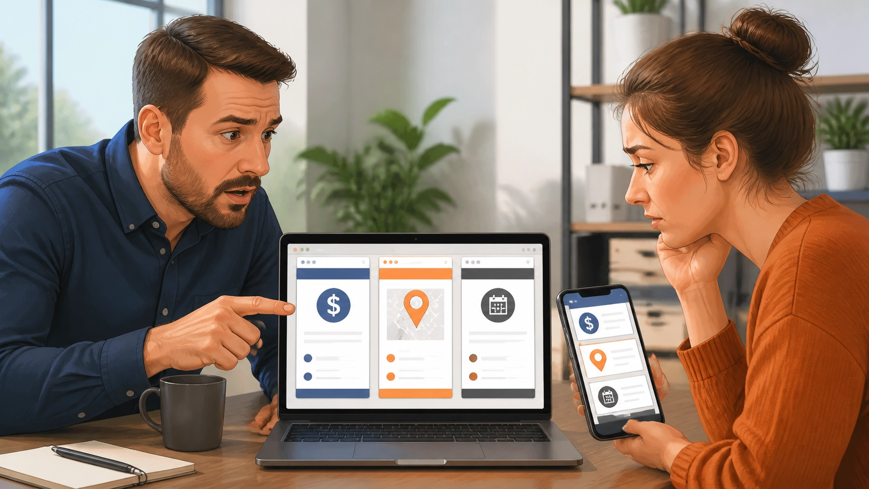
When we analyze why users feel overwhelmed, it usually stems from a lack of visual hierarchy. If every element on your page is screaming for attention, pop-ups, flashing banners, and three different call-to-action (CTA) buttons, the user will choose the easiest option: leaving.
To create a conversion-focused path, you must prioritize messaging and navigation:
- The 5-Second Test: Within five seconds of landing on your site, can a user identify exactly what you offer, who it’s for, and how to get it?
- Logical Navigation: Group your services logically. For a local business marketing agency, this might mean separating SEO, Paid Ads, and Website Strategy into distinct, easy-to-find categories.
- Predictive Messaging: Address objections before they are raised. Use clear headings like “Transparent Pricing” or “Our 4-Step Process” to reduce the uncertainty that kills sales.
Strategic Trust Signals: Engineering Certainty
In a digital world where anyone can buy a template and call themselves an “expert,” trust signals are your most valuable currency. However, trust isn’t built by just slapping a logo on a page. It’s built through the strategic placement of social proof and security markers.
Whether you are a dental practice or a home contractor, your users are looking for “safety markers” that tell them they are making a low-risk choice. This includes:
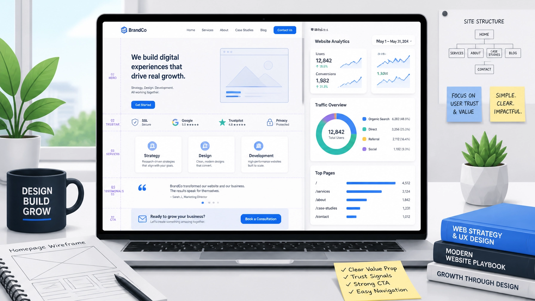
- Verified Reviews: Integrating live Google Business Profile reviews directly into the site.
- Case Studies: Showing real-world results that link design to business outcomes.
- Visual Proof: High-quality, real-world images of your team at work or your completed projects.
- Security Badges: Clear indications of secure checkout and data privacy, especially for e-commerce.

Practical Examples of UX Transformation
Let’s look at how these principles apply in the real world. Small tweaks often lead to the most significant gains in business performance.
- The “Less is More” Form: A local HVAC contractor reduced their lead form from seven fields to three (Name, Phone, Service Needed). The result? A 40% increase in qualified phone calls. By removing the friction of a long form, they captured more high-intent leads who were in a hurry.
- The Guest Checkout Win: An e-commerce brand removed the requirement to “Create an Account” before purchasing. This simple reduction in friction led to a 25% lift in completed transactions. Users want speed; forcing them to create a password they will forget is a conversion killer.
- The Sticky CTA: A professional law firm added a “sticky” call button to the mobile version of their site. No matter how far the user scrolled, the “Call for a Consultation” button stayed at the bottom of the screen. This created a constant, frictionless path to conversion that increased their mobile lead rate by nearly 50%.
Connecting Design Decisions to Your Bottom Line
At the end of the day, a website is a tool for growth. If your current site is beautiful but isn’t generating leads, it is a failed investment. Strategic web design requires looking beyond the screen and understanding the full architecture of choice.
By auditing your site for friction, prioritizing clarity, and reinforcing trust at every step, you turn your digital presence into your hardest-working salesperson. At Trust Media, we don’t just build websites; we engineer experiences that move the needle. Whether you need a full platform migration or a conversion-focused audit, the goal is always the same: clarity, trust, and measurable growth.

What is the “Friction Factor” in web design?
The Friction Factor refers to any element, technical or psychological, that slows down a user or prevents them from completing a desired action, such as making a purchase or filling out a contact form. High friction leads to high bounce rates.
How does website speed affect my SEO and conversions?
Google uses page speed as a ranking factor, but more importantly, users expect near-instant loading. Even a two-second delay can significantly increase your bounce rate and decrease your overall conversion rate.
Why is mobile UX different from desktop UX?
Mobile users typically have higher intent and less patience. They are often “on the go,” meaning they need simplified navigation, larger buttons, and streamlined checkout processes like Apple Pay or Google Pay to reduce the friction of typing on a small screen.
What are the most important trust signals for a local business?
For local service providers, the most critical trust signals are Google reviews, professional memberships (like the BBB), “Verified” badges, and clear contact information. Real photos of your team and equipment also build significantly more trust than stock photography.
Can UX improvements really increase revenue without more traffic?
Yes. By improving your conversion rate from 2% to 4%, you effectively double your revenue from the same amount of traffic. This makes your existing marketing spend twice as efficient.