By the time a shopper lands on your “Cart” page and decides to leave, it’s rarely a snap judgment. In most cases, the decision to abandon the purchase wasn’t made at the final step, it was made three pages ago, buried under a mountain of tiny, unresolved questions.
In e-commerce marketing, we often fixate on the final moment of friction: the checkout form, the shipping cost surprise, or the “buy” button placement. While these are critical, focusing solely on the end of the funnel ignores the Decision Debt your customers are forced to carry while browsing.
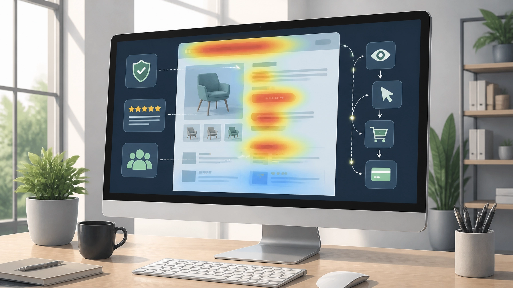
Decision Debt is the psychological weight of micro-doubts that accumulate every time a shopper encounters an unclear product description, a missing spec, or a vague shipping policy. If that debt gets too high, the shopper exits before they ever think about clicking “Add to Cart.”
The Invisible Leak: Why Browsing is the Real Conversion Driver
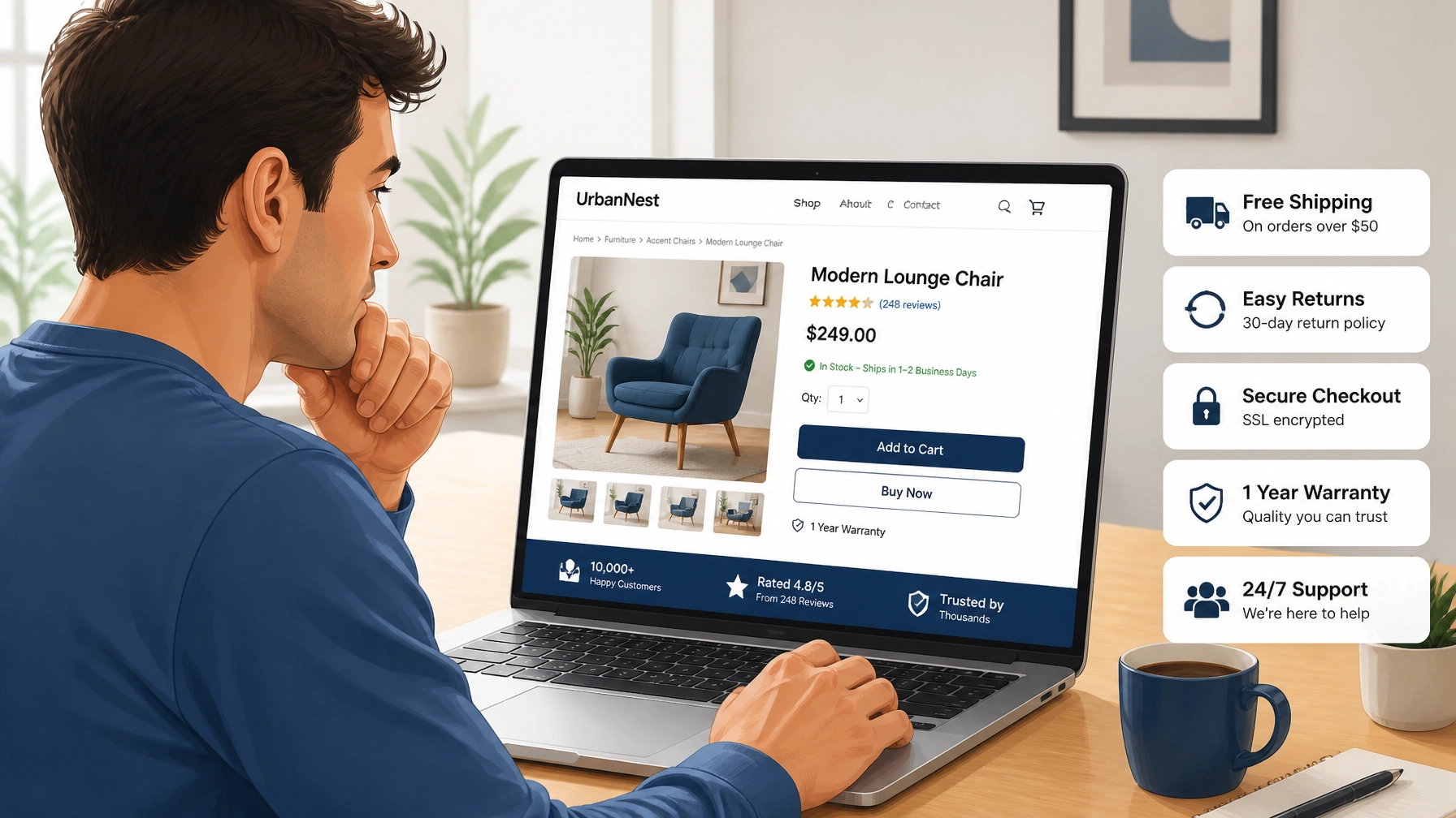
Most brands treat the Product Detail Page (PDP) as a digital brochure. In reality, it is a high-stakes interrogation room where the customer is looking for any reason to say “no.”
Modern shoppers are savvy and skeptical. They don’t just look at your primary product image and check the price; they scan for social proof, verify compatibility, and subconsciously measure the effort it would take to return the item if it fails their expectations.
When you fail to answer these unspoken questions in real-time, you create micro-frictions. Research from the Contentsquare 2024 Digital Experience Benchmark report suggests that “friction density”: the accumulation of multiple small issues like slow load times or unclear navigation: is one of the strongest predictors of session abandonment.
If your navigation architecture is confusing or your search bar returns irrelevant results, you’ve already started the shopper’s journey with a deficit. They are spending their limited cognitive energy just trying to find the product, leaving them with very little left to actually decide to buy it.
The Anatomy of Decision Debt
To understand how to reduce this debt, you must first recognize the difference between a “High-Debt” experience and a “Low-Debt” experience. One forces the customer to do the work; the other provides immediate clarity.
| Experience Factor | High-Debt (Friction-Heavy) | Low-Debt (Frictionless) |
|---|---|---|
| Product Imagery | One or two studio shots with no context. | Multi-angle shots, lifestyle context, and video. |
| Sizing & Specs | A generic “Size Chart” link that opens a PDF. | Dynamic size guides based on customer height/weight. |
| Shipping Info | Hidden in the footer or only visible in the cart. | Clear “Delivery by [Date]” displayed near the price. |
| Social Proof | A generic 4.5-star rating with no text reviews. | Filterable reviews with customer photos and “Verified” tags. |
| Inventory Status | “In Stock” (vague and untrustworthy). | “Only 4 left – Ships in 24 hours.” |

Strategic Social Proof: Placement Matters
We’ve all heard that social proof is essential. However, many e-commerce brands bury their reviews at the very bottom of a long scroll, treating them as a “validation” step rather than a “decision” step.
To reduce decision debt, social proof needs to be integrated into the browsing experience before the customer has to hunt for it. This isn’t just about showing that people liked the product; it’s about answering specific doubts.
If you sell professional-grade tools, the shopper’s doubt isn’t “is this good?”: it’s “will this hold up under daily use?” Placing a “Verified Professional” review badge next to the technical specifications addresses that doubt exactly when it’s most likely to surface.
“User-generated content (UGC) is no longer a ‘nice-to-have’ for e-commerce. When customers see real photos from real people in a context that matches their own, the psychological distance between the screen and the physical product disappears.” : Digital Commerce 360
By placing these trust signals near the “Add to Cart” button or the price display, you are performing a “risk reversal” in real-time. You are telling the customer: You don’t have to take our word for it; look at everyone else who already solved this problem.
Navigation Architecture as a Trust Signal
Your store’s navigation is often the first interaction a shopper has with your brand’s logic. If your categories are cluttered or your filters don’t work as expected, the shopper assumes the rest of your business is just as disorganized.
We see this frequently in our growth consulting at TrustMedia. A brand might have a high-performing ad campaign driving traffic to a collection page, but if that page doesn’t allow the user to quickly narrow down their choice by size, color, or price, they leave. This is what we call The Performance Mirage: your ad metrics look great because you have traffic, but your revenue is stagnant because the on-site experience is failing.
Frictionless navigation allows the shopper to maintain their momentum. Every successful filter application is a “micro-yes” that leads toward the ultimate “yes” of the purchase.
Clarity Over Cleverness
When it comes to product descriptions, clarity beats cleverness every single time. A “High-Debt” product description uses flowery marketing language that tells the customer how they should feel. A “Low-Debt” description gives them the facts they need to decide.
Consider these two descriptions for a rain jacket:
- Clever: “Embrace the elements with our signature cloud-soft outer shell, designed for the modern adventurer who refuses to stay inside.”
- Clear: “10,000mm waterproof rating. Taped seams. Underarm vents for breathability. Fits true to size with room for a light sweater.”
The first creates debt because the shopper still doesn’t know if they’ll stay dry in a downpour. The second eliminates doubt immediately. When you force a shopper to open a new tab to research what “signature cloud-soft” actually means, you’ve likely lost them to a competitor who was more direct.
This gap between the customer’s need for certainty and the brand’s desire to “sell” is what we often refer to as The Hesitation Gap. While that gap is most visible at checkout, it is paved during the browsing phase.
Building the Confidence Bridge
If you want to dominate your e-commerce niche, you need to stop thinking about your website as a catalog and start thinking about it as a confidence-building machine.
Every element on your page should serve a purpose:
- High-resolution zoom eliminates the doubt about material quality.
- Comparison tools eliminate the doubt about which model is right for them.
- Stock indicators eliminate the doubt about whether they’ll receive it in time for their deadline.
When you solve these micro-doubts proactively, you aren’t just increasing your conversion rate; you are building long-term trust. A customer who feels confident during the browsing phase is more likely to become a repeat buyer because they know exactly what to expect from your brand.

Partnering for E-commerce Growth
Managing the delicate balance between brand storytelling and friction reduction is where many e-commerce teams struggle. It requires a deep understanding of customer psychology, data-driven design, and technical execution.
At TrustMedia, we specialize in identifying the invisible leaks in your e-commerce funnel. We don’t just look at why people are leaving their carts; we look at why they aren’t adding to them in the first place. By auditing your product page clarity, navigation architecture, and trust signals, we help you pay down the “Decision Debt” that is currently costing you revenue.
Ready to see where your shoppers are hesitating? Partner with a team that moves the needle through strategic clarity and measurable growth.

What is the most common reason for browsing abandonment?
The most common reason is “information asymmetry”: where the shopper has more questions than the page provides answers for. This usually manifests as missing shipping costs, unclear product specs, or a lack of credible reviews. When the mental effort to find an answer exceeds the desire for the product, the shopper leaves.
How many product photos should an e-commerce page have?
There is no “magic number,” but research consistently shows that 5 to 8 images: including lifestyle shots, close-ups of texture, and 360-degree views: drastically reduce decision debt compared to a single studio shot.
Should I use B2B or B2C timing for trust signals?
In B2C, trust signals should be immediate and emotional (reviews, fast shipping). In B2B, they should be more technical and consultative (white papers, technical specs, expert endorsements). However, in both cases, the signals must appear at the moment the doubt arises, not just in the footer.
Is a one-page checkout always better than multi-step?
Not necessarily. While one-page checkouts reduce interaction friction, multi-step checkouts can actually build trust by showing a clear progression and giving the user a sense of “confirming” their details at each stage. The key is reducing the total number of fields, not just the number of pages.
How do I identify which micro-doubts my customers have?
The best way is a combination of quantitative and qualitative data. Use session recordings to see where users “hover” or “rage click,” and use post-purchase surveys to ask: “Was there anything that almost stopped you from buying today?” The answers will often point directly to your highest decision debt areas.